
GRAPHIC DESIGN
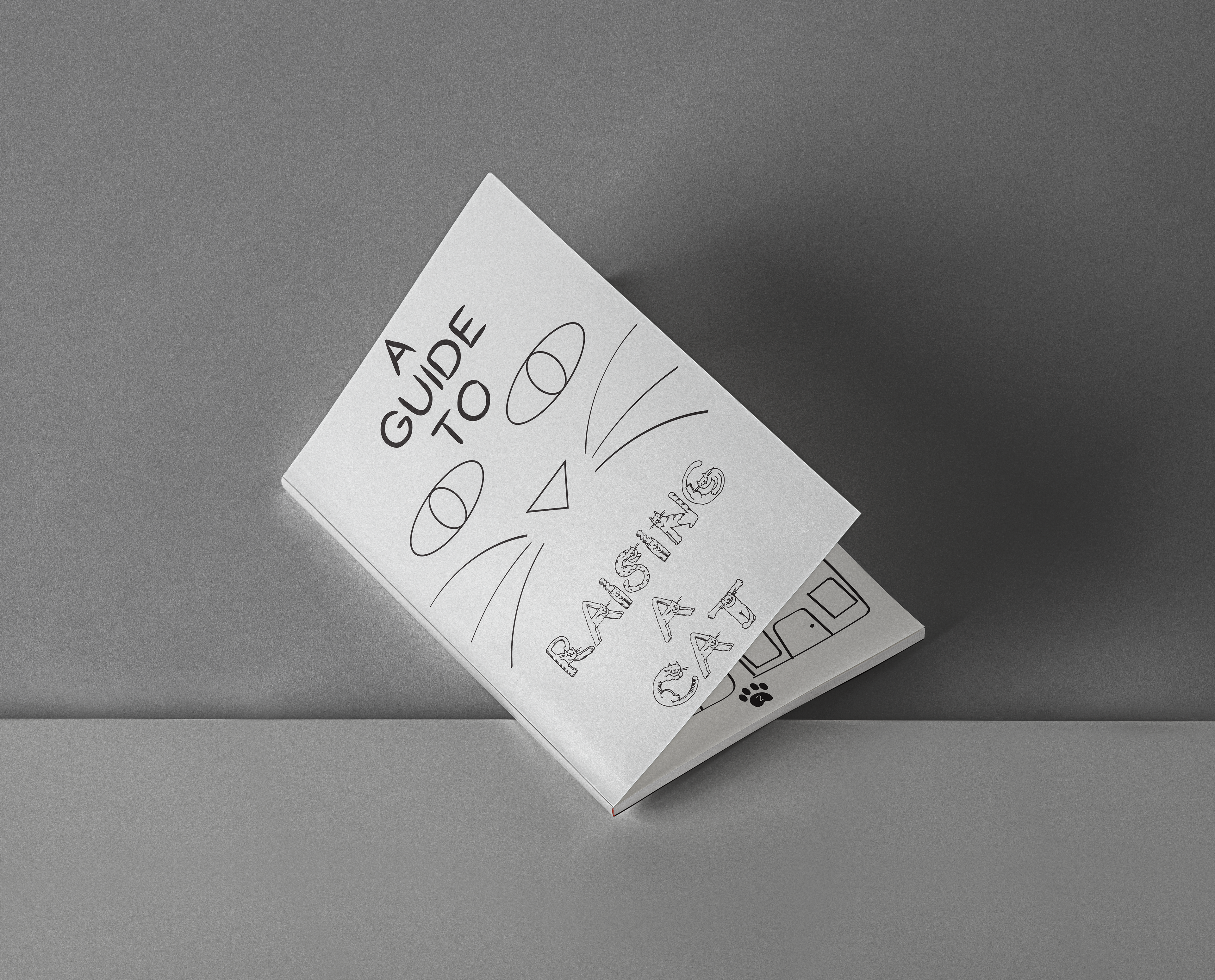
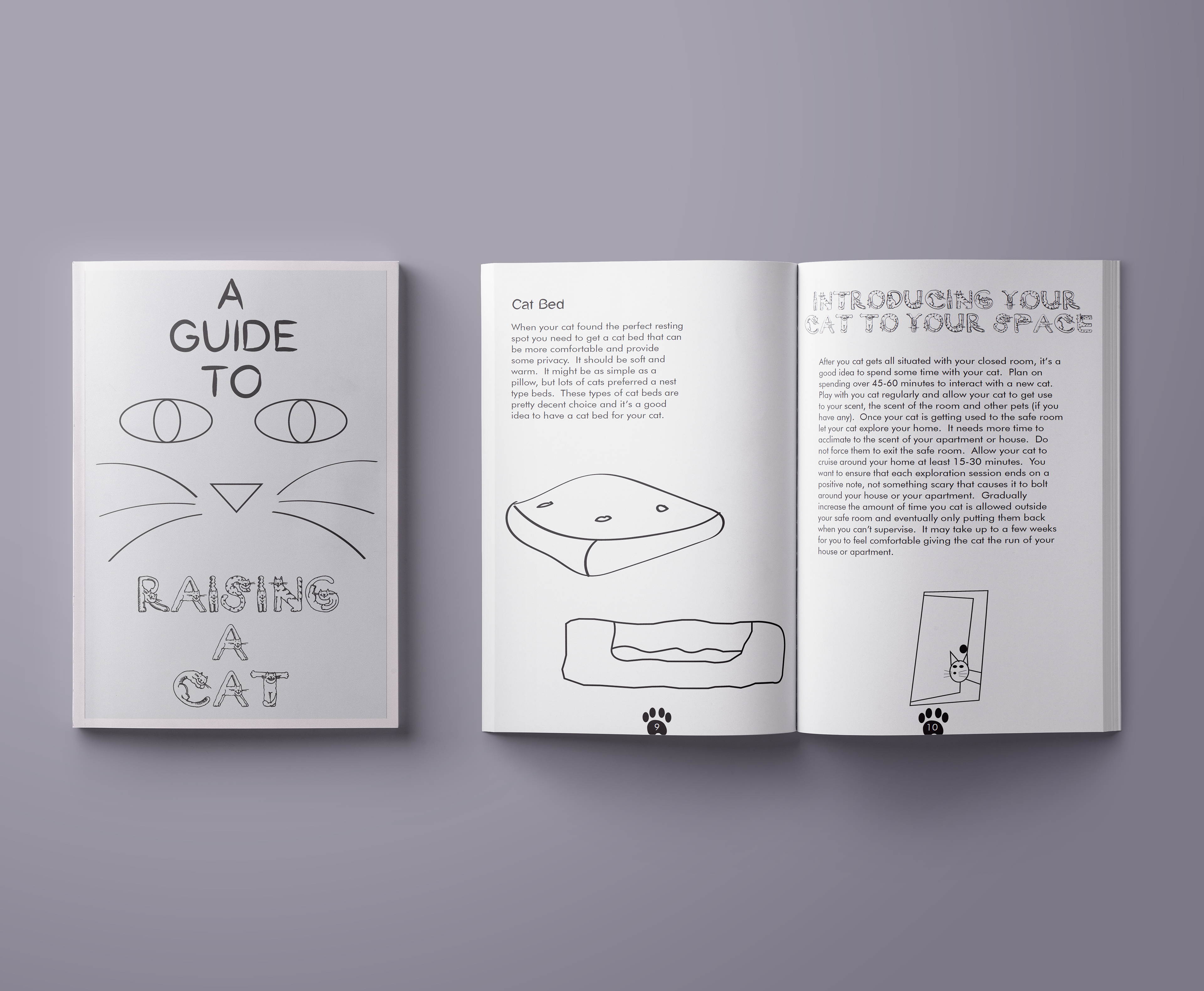
"RAISING A CAT" ZINE
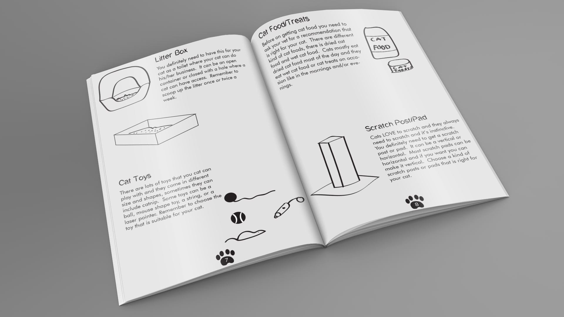
The zine design was created for young people by using the combination of loose and tight illustrations. The textbook style grid structure provides information on raising a cat for the first time. The pacing and emphasis in every section of the book gives the viewer more meaningful time to read and look at the illustrations. Illustrator and InDesign are the tools I use to make this zine.
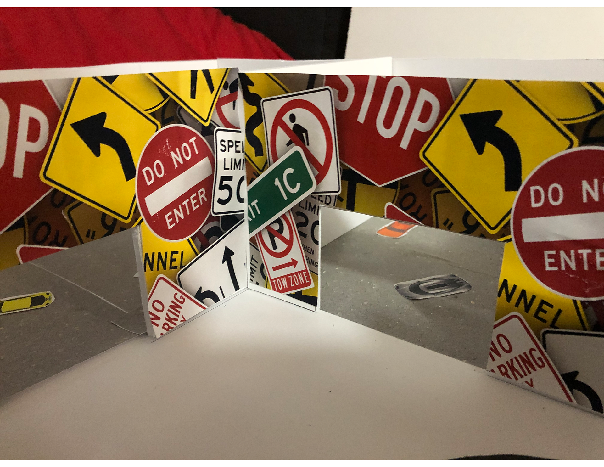
"WORLD OF CAR CULTURE" EXHIBITION
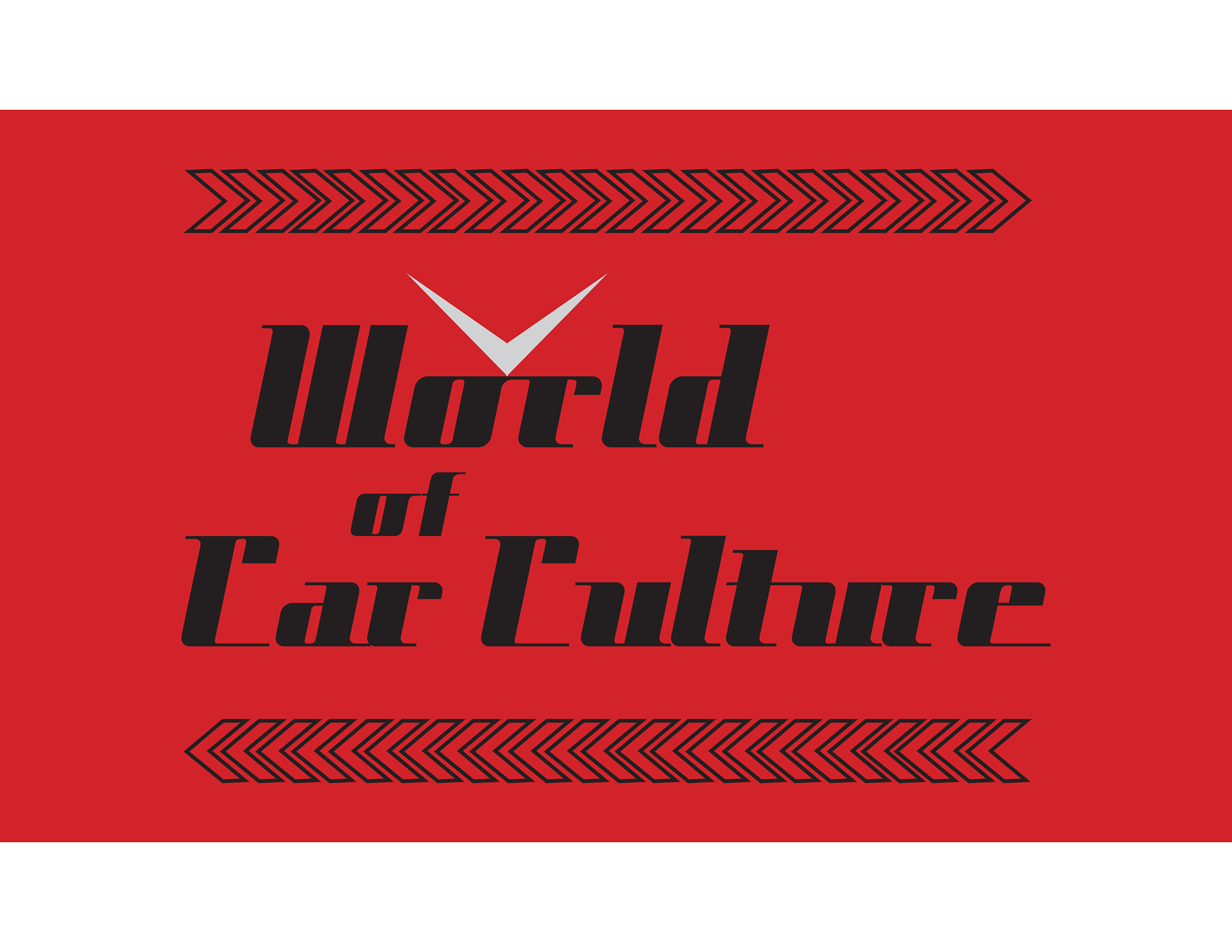
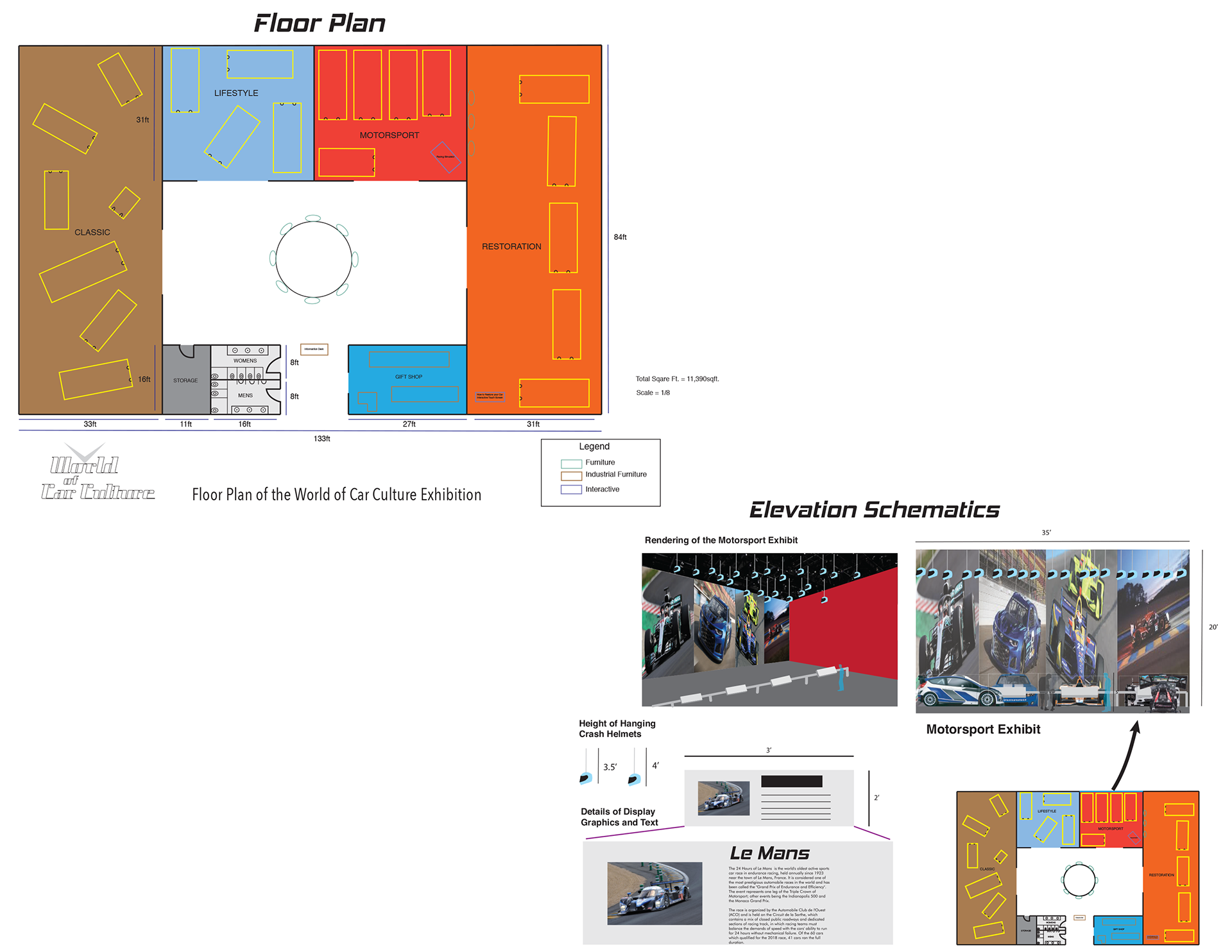
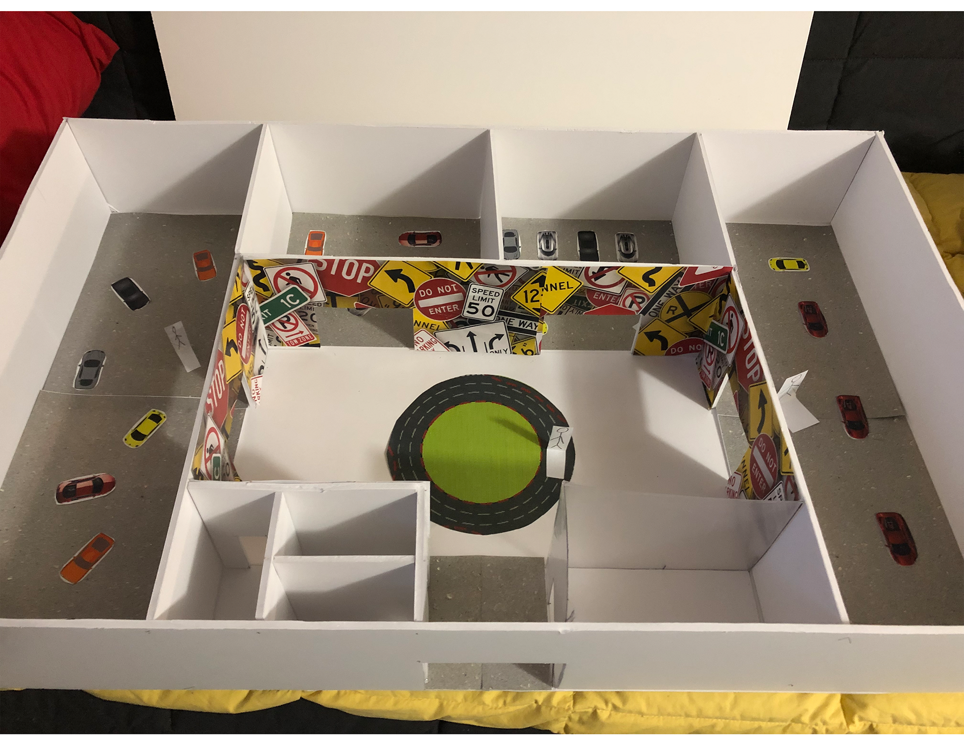
This was a class project to design an exhibition of our choice using various given parameters. The comprehensive exhibition design focuses on the world of car culture. Audiences can visit to learn about the fundamentals of cars and their role and meaning in their lives. A giant wall of traffic signs at the entrance tells the visitor they are about to enter the world of cars. Each part of the exhibit utilizes a different visual language and text, signifying certain aspects of the cars exhibited there, but colors and other graphic choices unify the exhibition. The logo, floor plan, and the elevation schematics were done mostly through Illustrator while the model was built by hand.

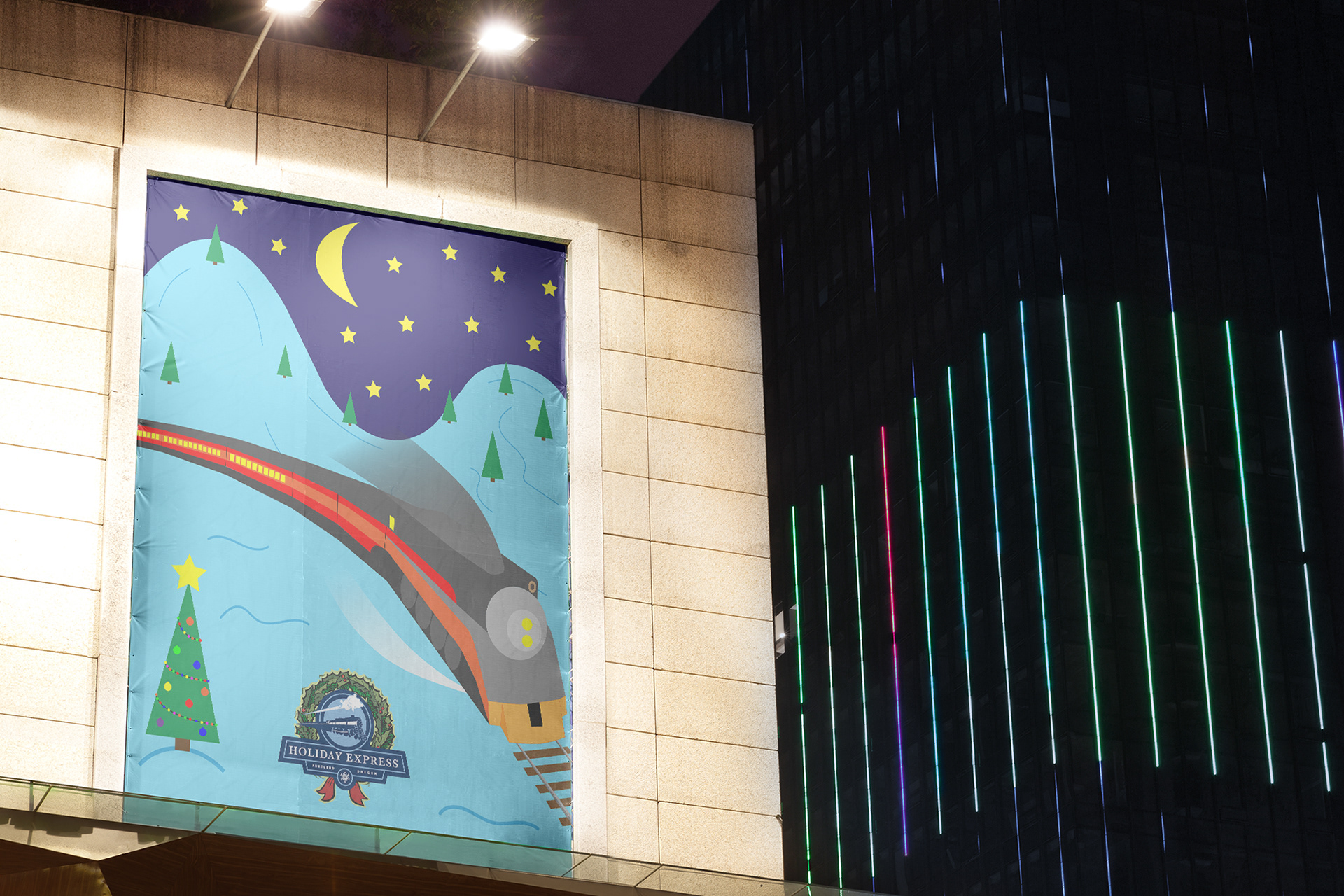
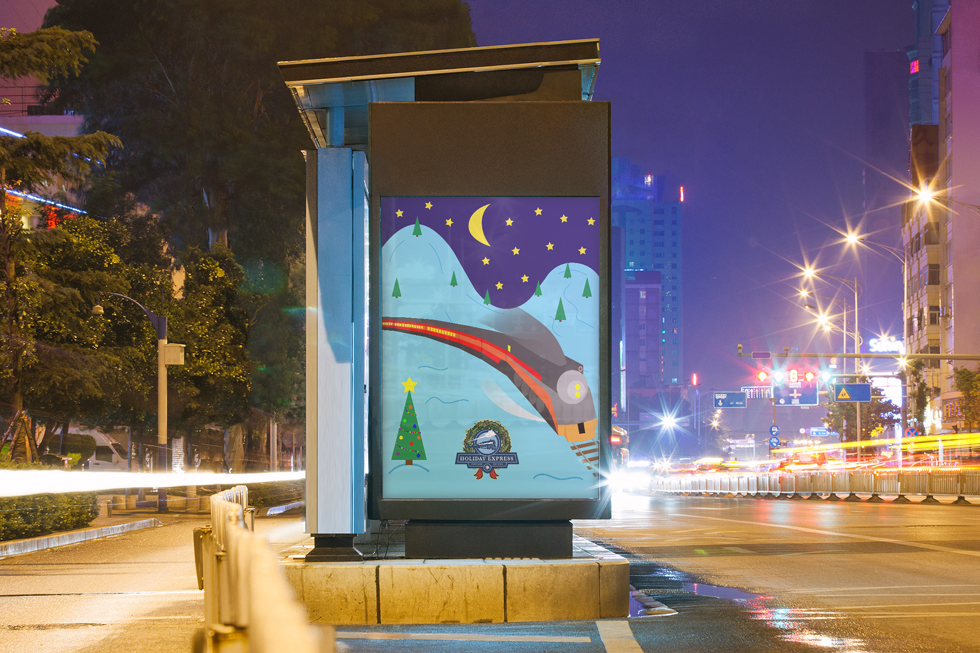
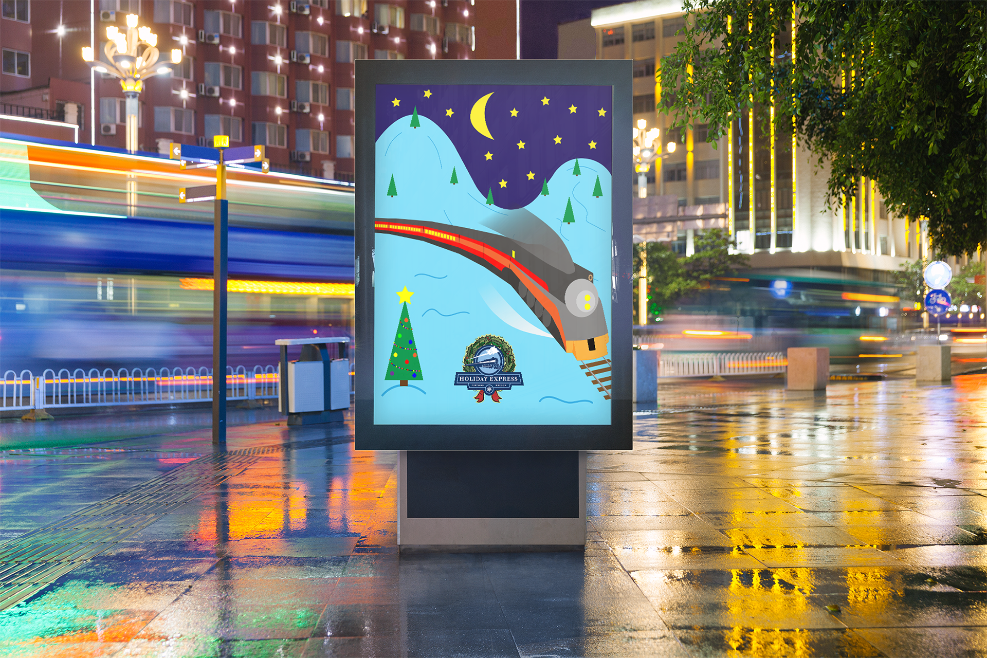
HOLIDAY EXPRESS POSTER
I have been interested in trains from the time I was a little boy. I created this poster for the annual train ride during the holidays. The art style is from a children's scrapbook to let us imagine that we are in a child's mind. This poster was done in both Illustrator and Photoshop.
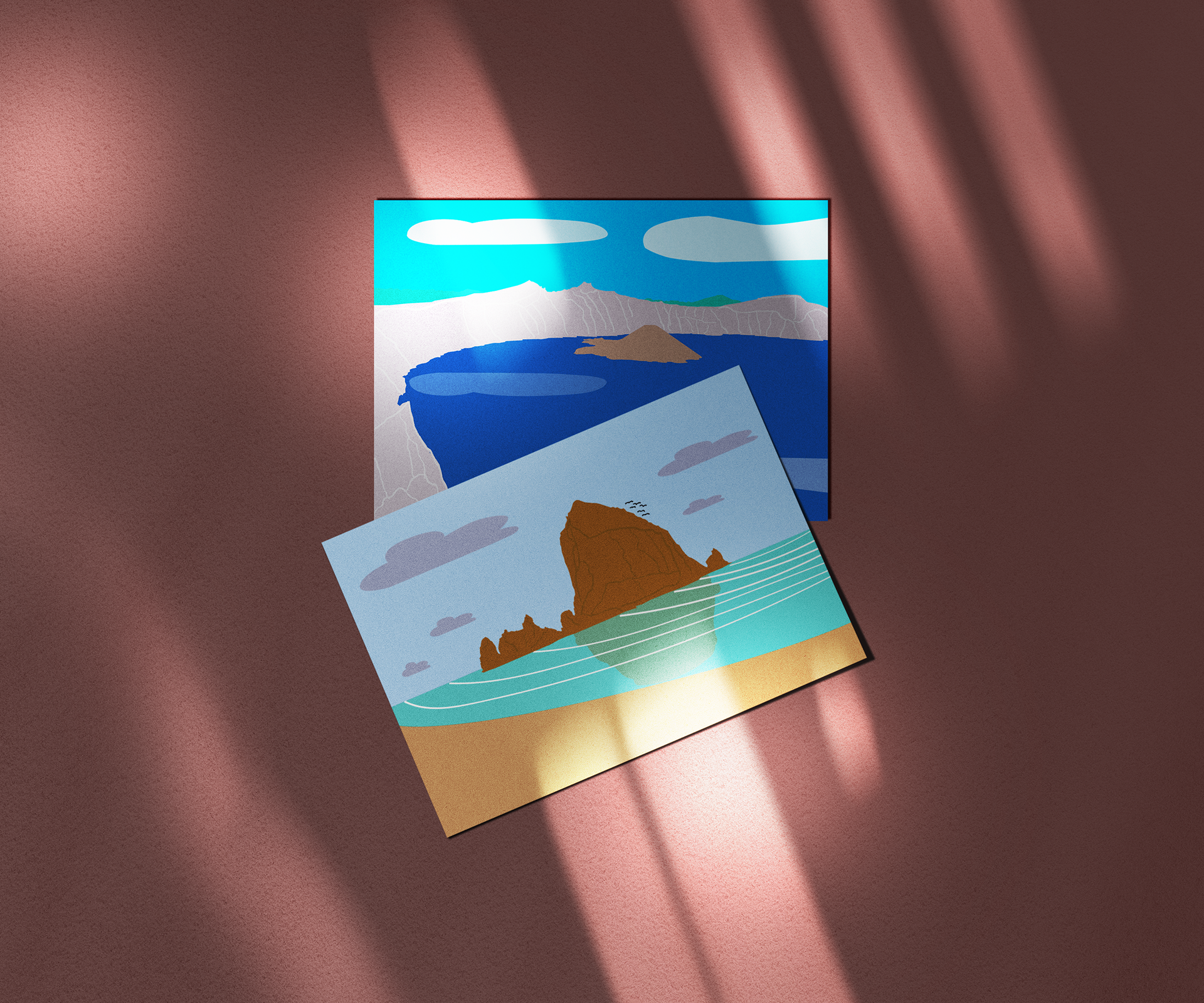
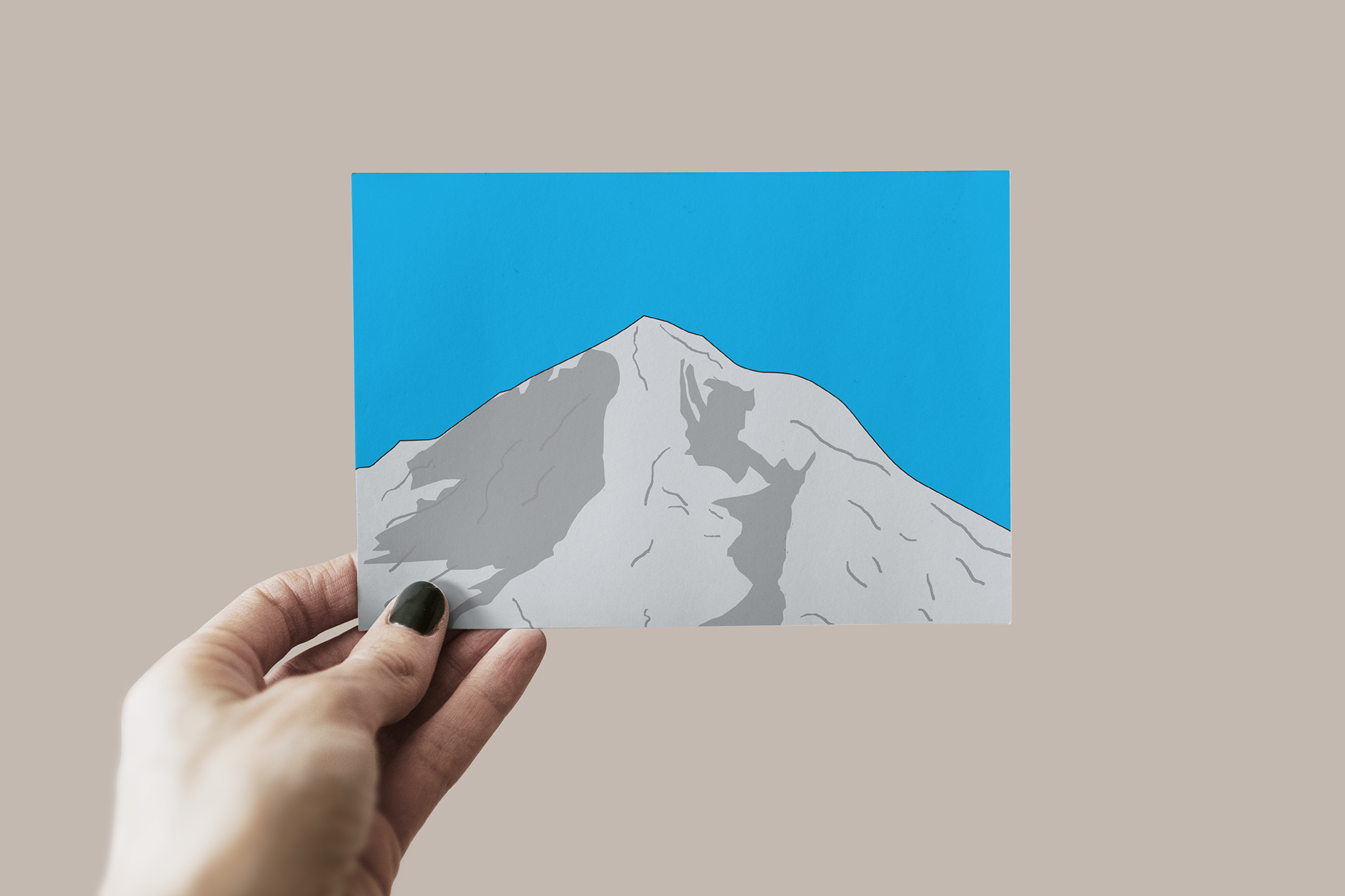
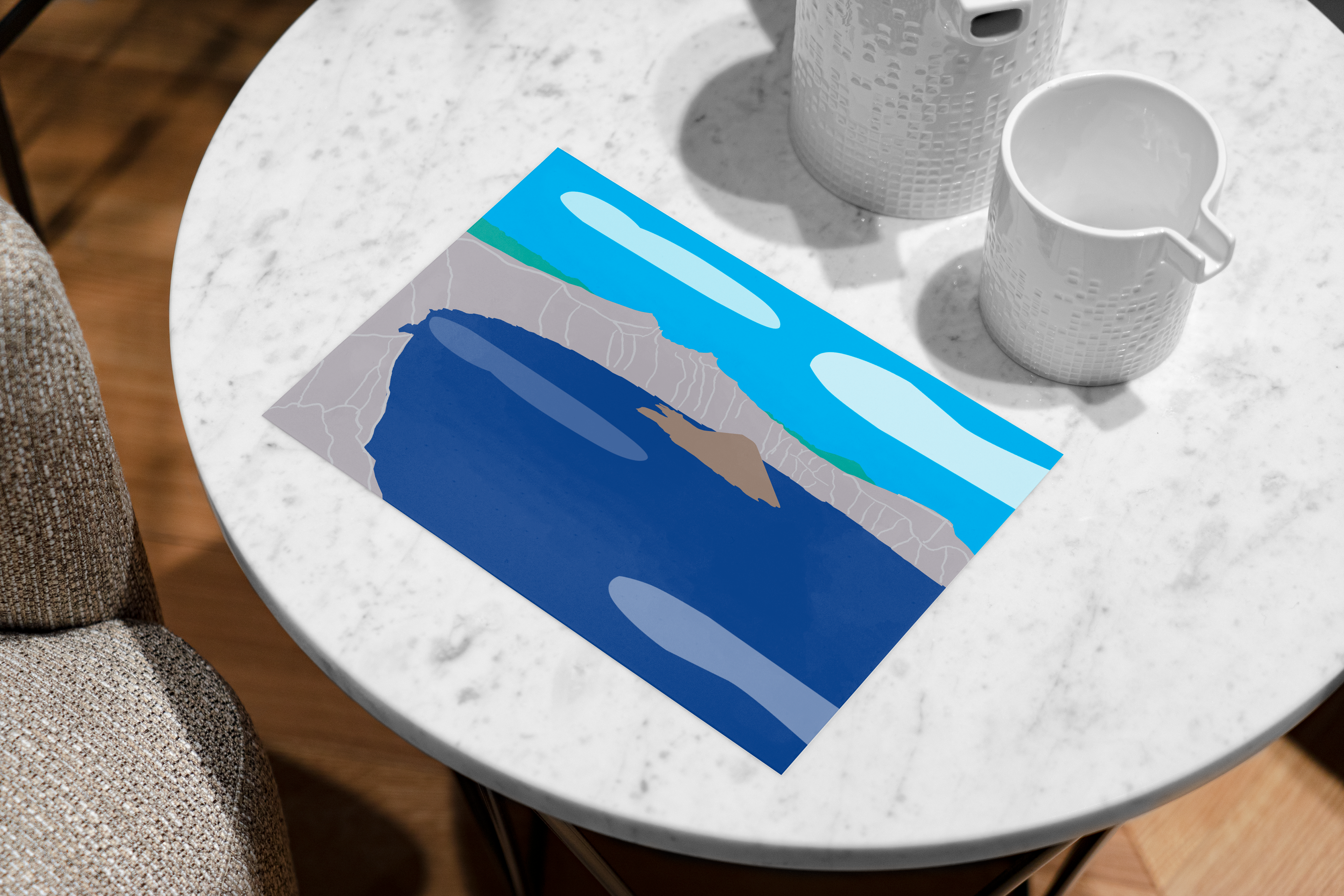
OREGON LANDMARKS
These postcard-like designs focus on the natural landmarks of Oregon and were done in both Illustrator and Photoshop. I created these pieces to represent the places I love to visit on living in the Pacific Northwest. Each natural wonder symbolizes the culture of Oregon and should appeal to people who live in the state.
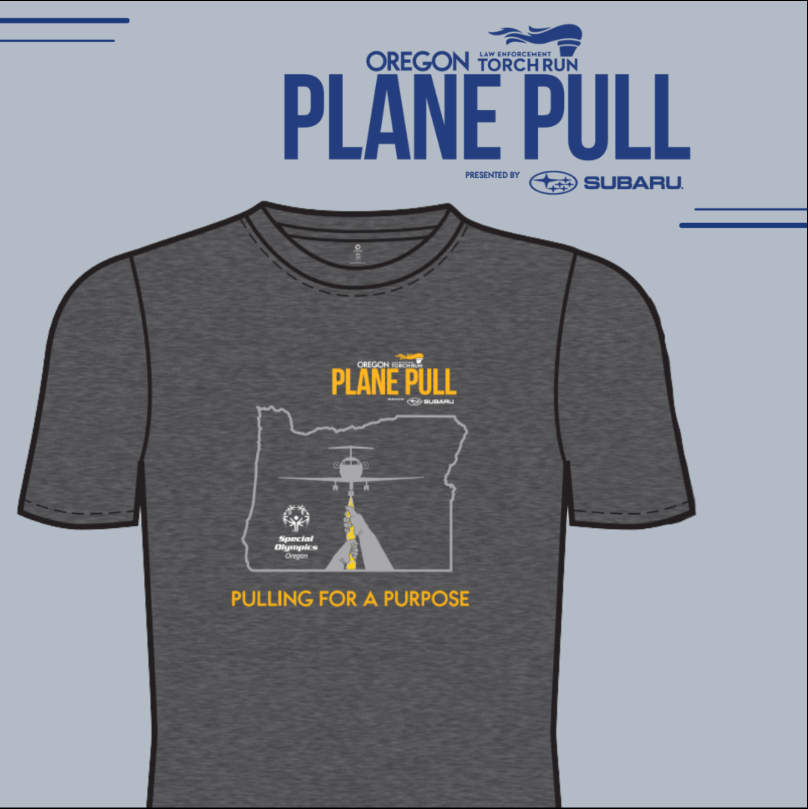
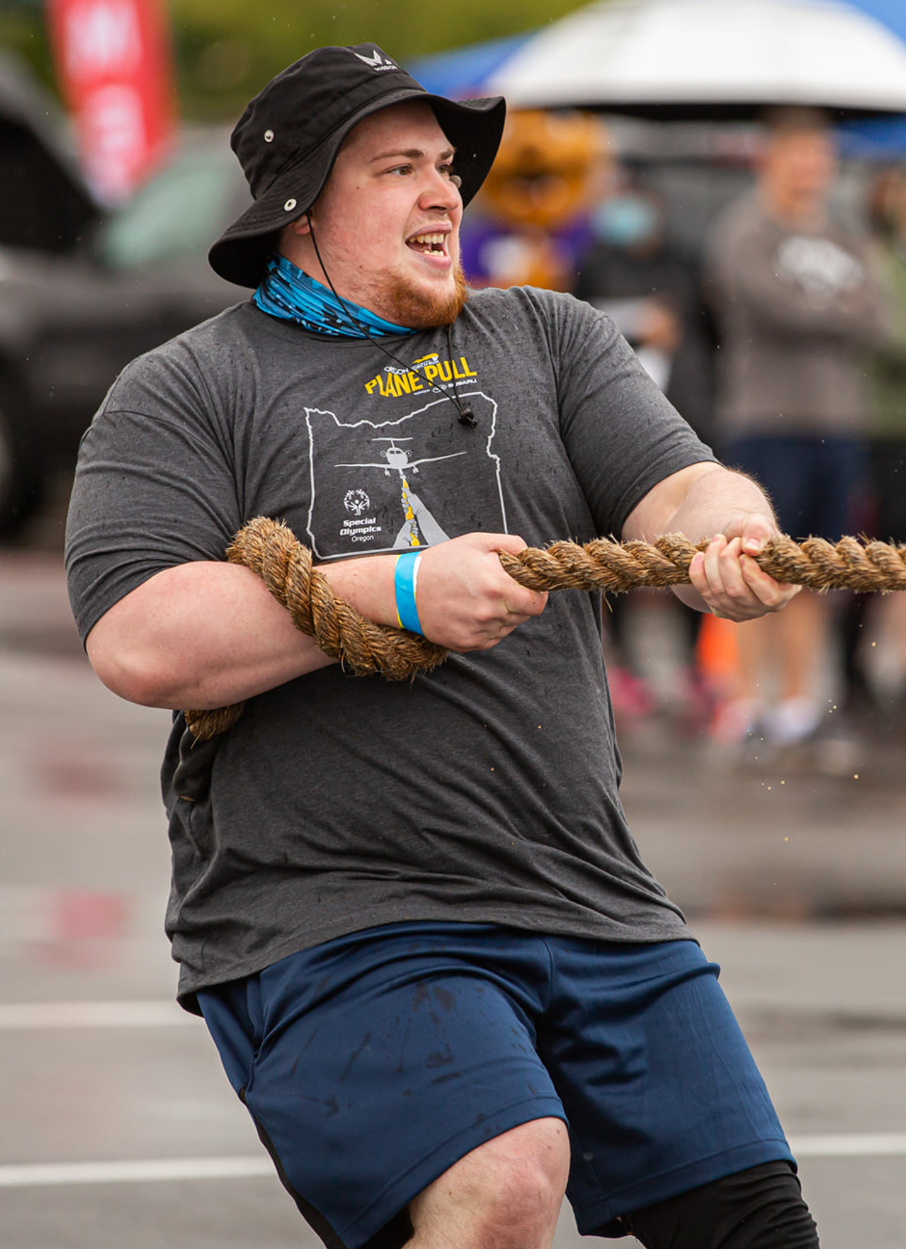
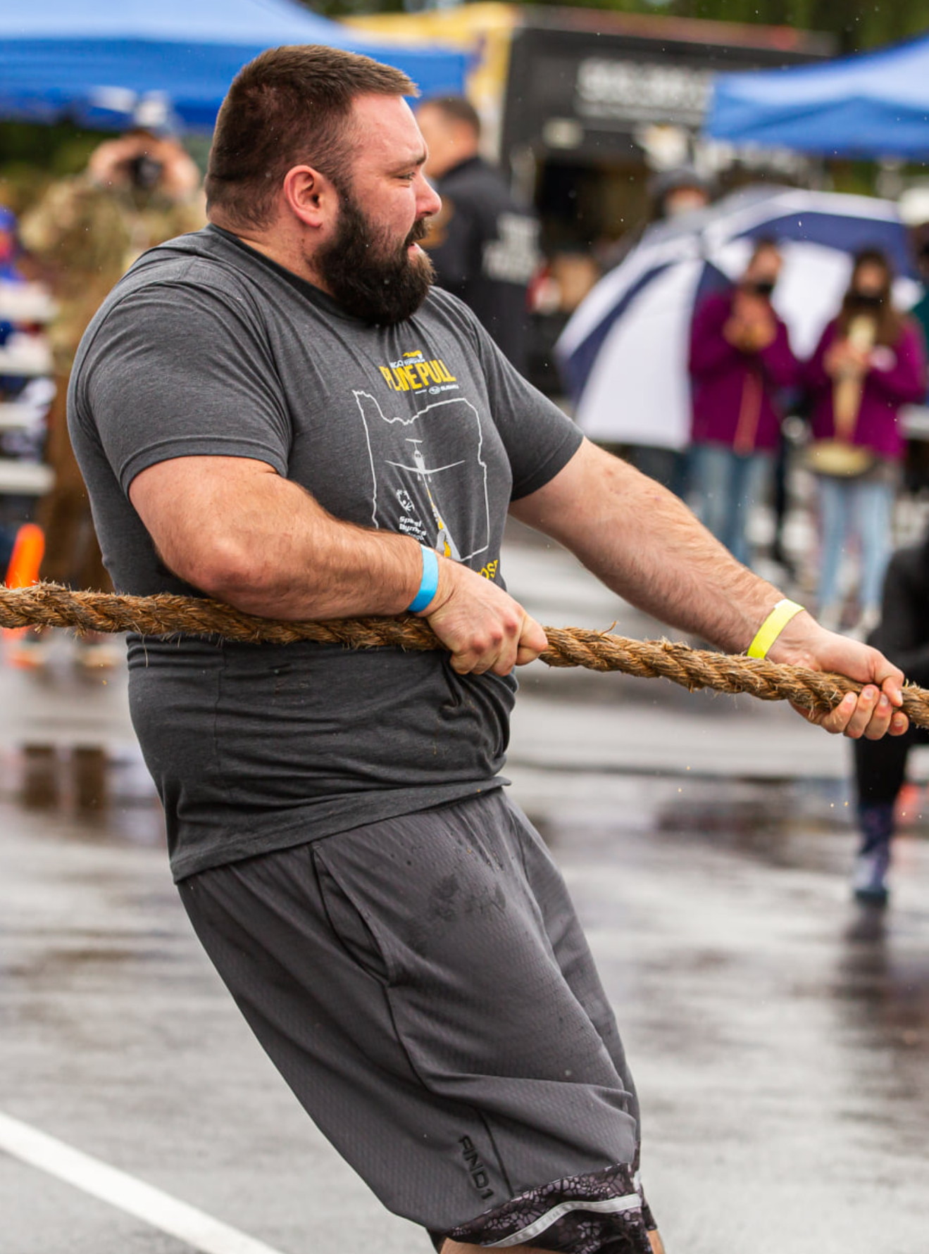
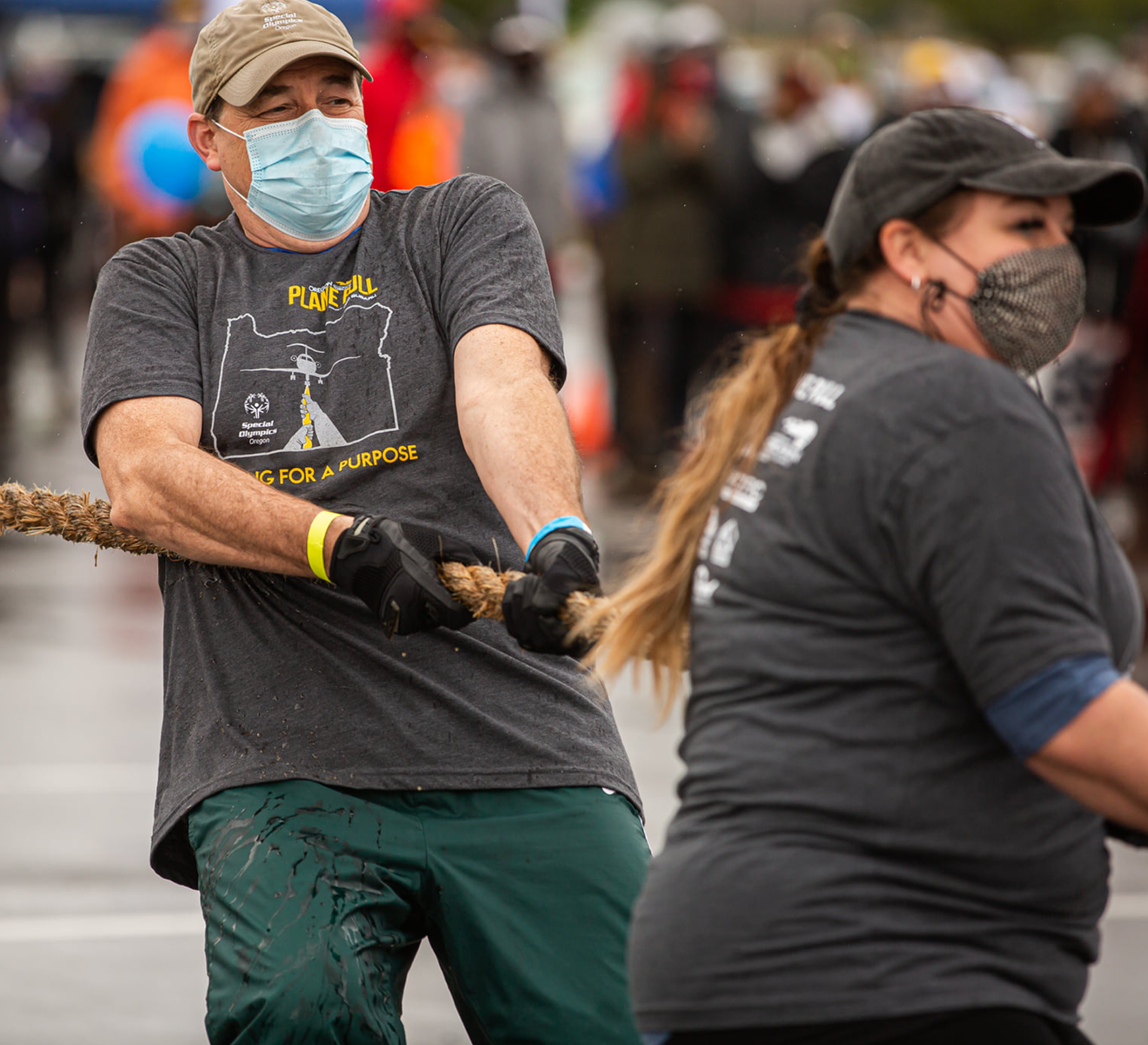
2021 Special Olympics Oregon Plane Pull T-Shirt Logo
This is a project I was reached out by Special Olympics Oregon Marketing Department. They wanted me to make a logo for the front of the T-Shirt for the fundraiser called the Plane Pull. I had the idea of having the plane being pulled from the puller's perspective and have the plane they used for the event. I also have the state boundary as the frame. The typography, colors, and T-Shirt color were provided by SOOR. This was mostly done on Illustrator.
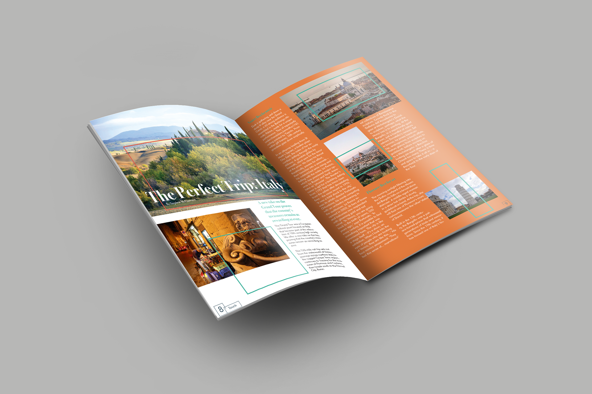
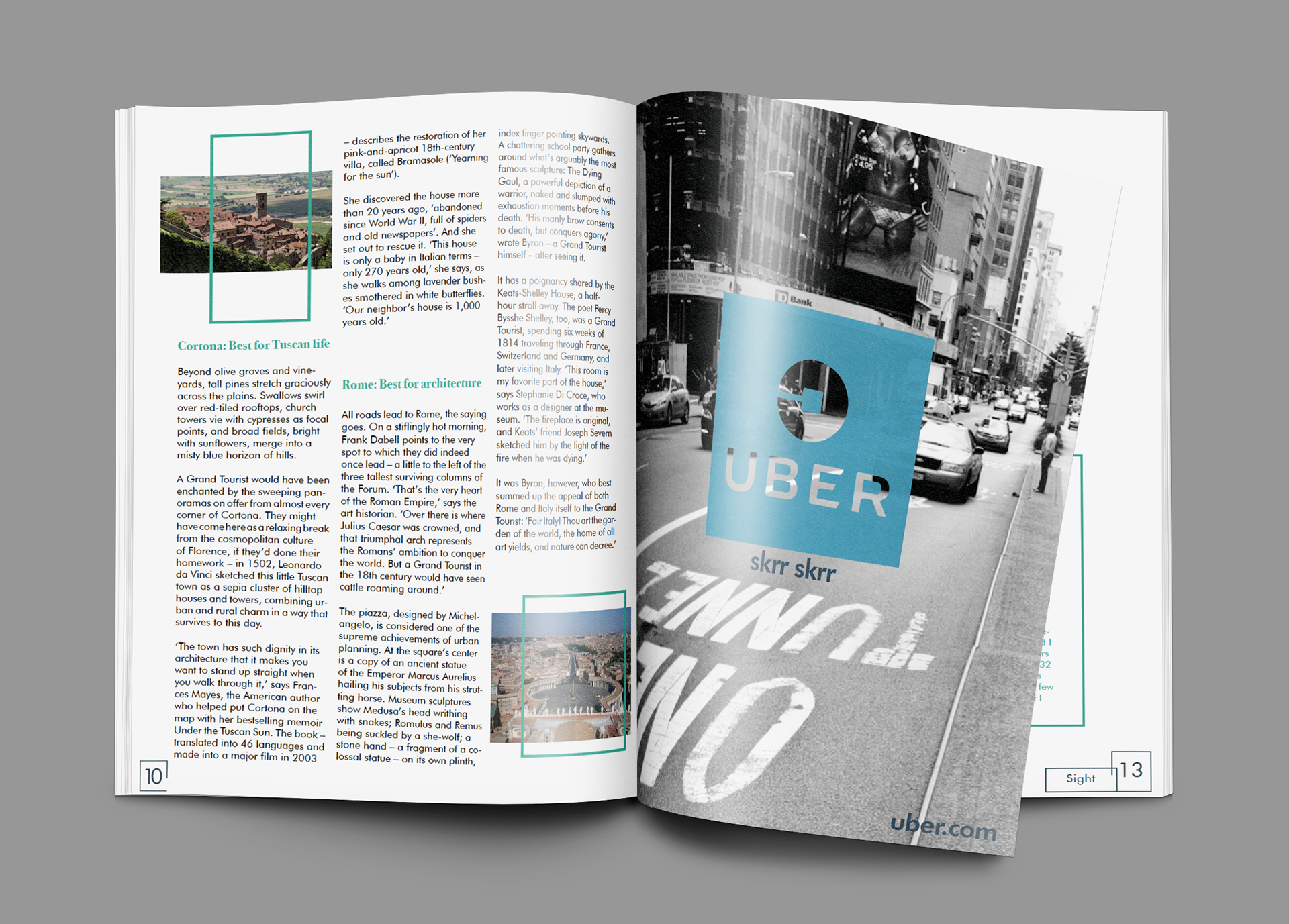
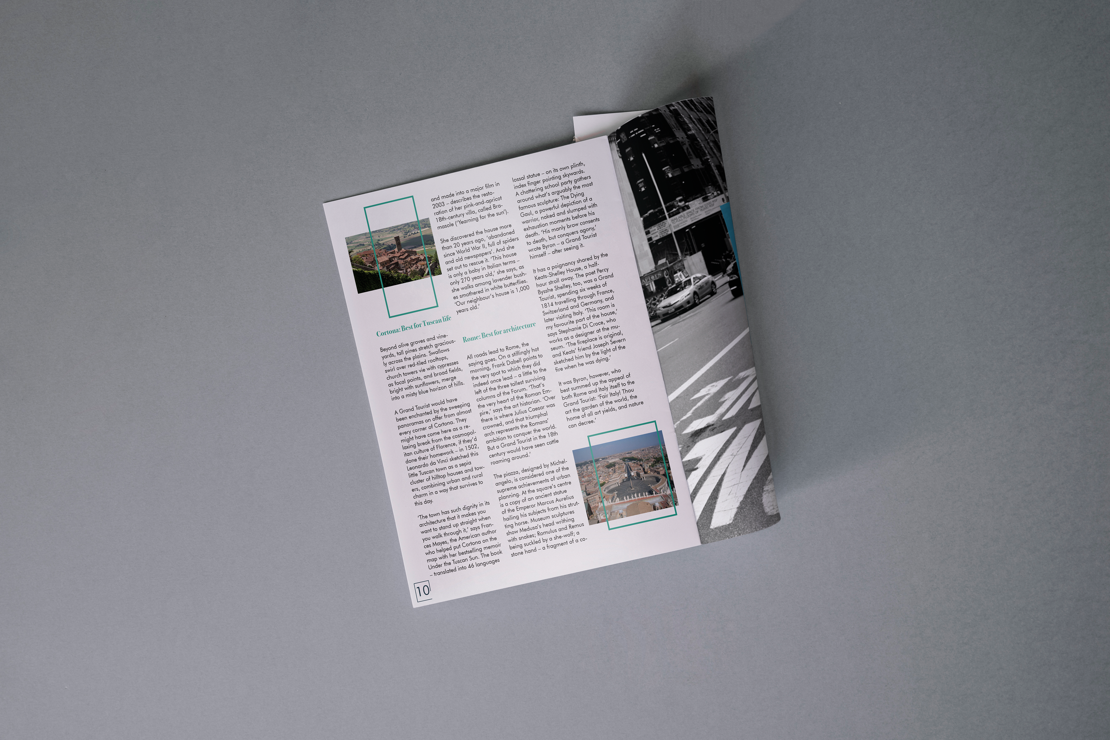
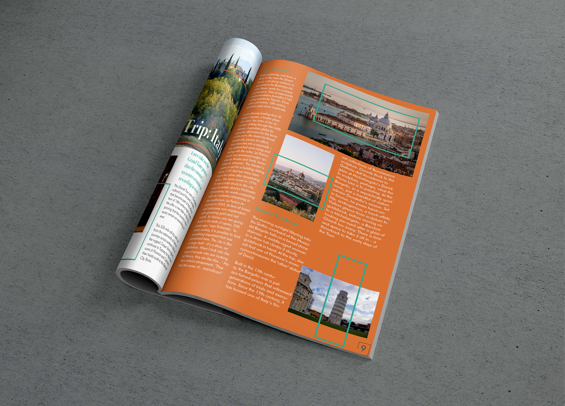
"BROKE MILLENNIAL TRAVEL GUIDE (BMTG)" MAGAZINE
This was a collaborative project also created during college aimed to design a magazine. The focus was to educate millennials on how to travel without a big travel budget. Each section of the magazine deals with the five senses of the human body when traveling I was responsible on making the editorial section in three pages that deals with the sense of touch when visiting Italy. The typography and colors was chosen by the group. I created the text column layout, organized the photos, and made the rectangle borders that would romanticized Italy. This was done by Illustrator and InDesign.
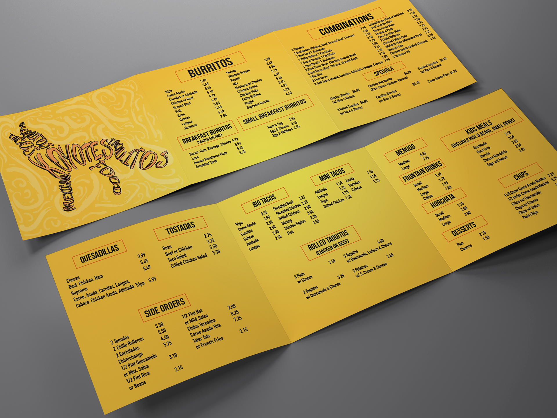
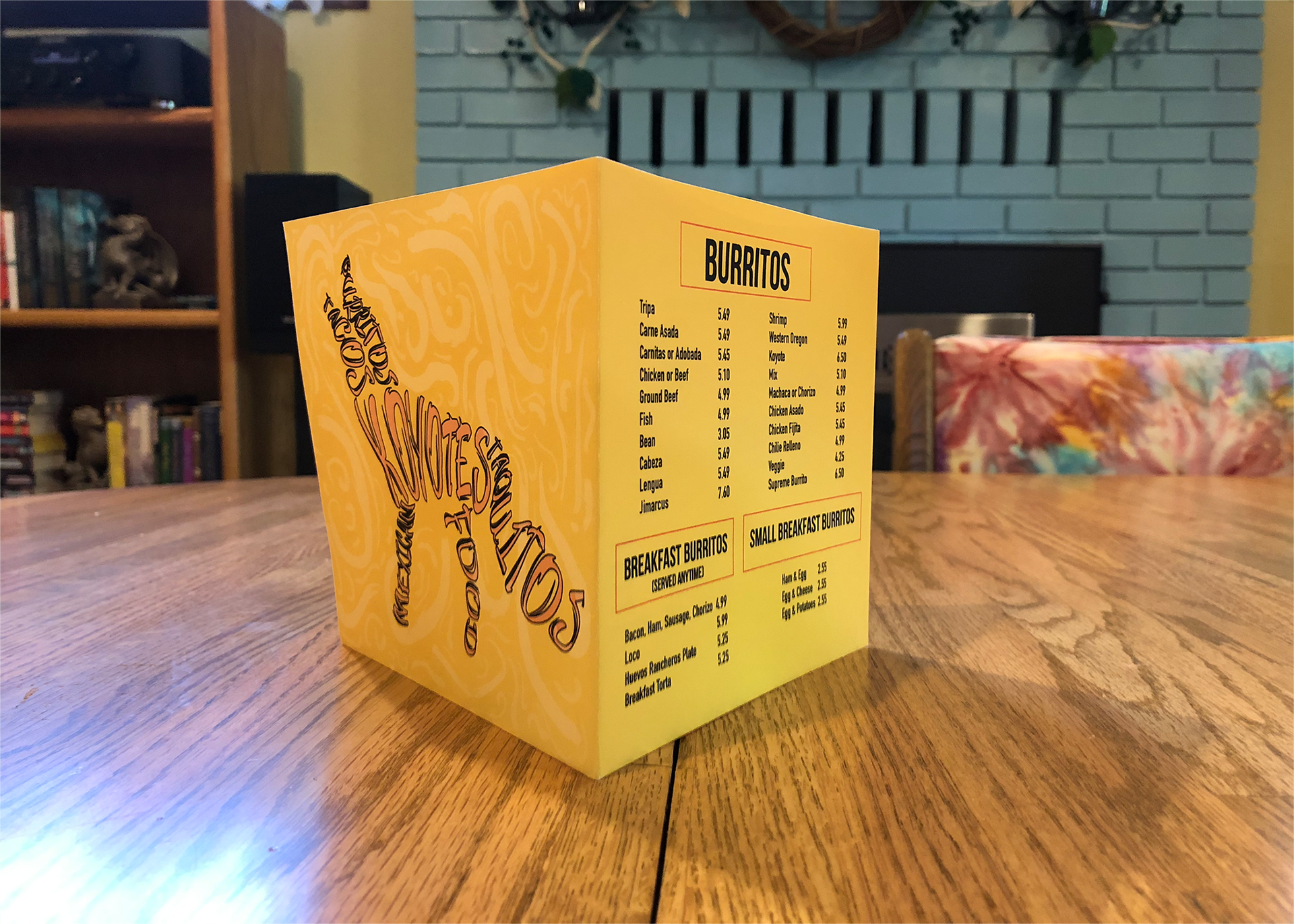
KOYOTES MEXICAN RESTAURANT LOGO & MENU
Illustrator & InDesign were used to create another collaborative project assigned in college. The new logo and menu were created that fits the theme and tone of the Mexican restaurant. I was responsible on making the typography, the borders around the headers, and the layout of the menu. The logo and the background were done by my partner.